
Week 5 response

Inspired by the reading, I find evidence that service and sales industry take advantage of practicing propaganda, marketing, graphic design, and commercial art. 

I made a no prize quiz: what's brand of the Cafe by looking the colors? It is a very short video.


Starbucks, Luckincoffee, and Costa.


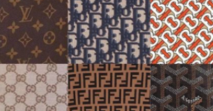
These three are the hottest cafe brands in China. As you can see, you can guess through the combination of paper cup and the color. The paper cup as a kind of pattern help you recall coffee or tea. Then, the colors are the most important. In my perspective, these cafe brand occupied colors for their brand. If another cafe company using similar green color for their logo. It's easy for people to be compared it with Starbucks. These cafe brands swear the sovereignty of color, and people cannot help linking with the brand when they see the color. This automatic cognitive association happened in our brains, proves that these cafes take advantage of practicing propaganda, marketing, graphic design, and commercial art. Similarly, famous clothing brands also have their private regular patterns and colors. I think you can come up a lot. Here are some examples. Even if these patterns are incomplete, our brain can distinguish or complete them.


Although the reading don't want to talk more about the propaganda, marketing, graphic design, and commercial art. But it is good know. Especially for brand logo designers. 

Then, the book give us various introductions of pixel, dots, stripes, grids, elements, colors, scales, orientations, iconic patterns, regular, irregular, random repeat, rules of patterns, also, code based patterns having vary inputs and organizing by centralizing, overlap, time and motion. It shows us art in many areas such as science diagrams. I like the technology feelings of these complex diagrams designs in book. The points and lines have ultimate possibilities. Every time I see these designs, I lament how powerful the human brain is. 

In addition, the pixel, cubes, and gris remind me that the digital images are not perfect. They are all by very small squares of colors. It give me ideas for drawing people's skin. There are actually green and red in skin because the vessels under it. It is a good idea to add very small amount of green and red or purple to make the skin looks more real. I will try this idea next week in my painting. 

By the way, these are small world I found in irregular raindrops on the window. I never notice this until recent.


Comments

  1. Love the raindrops! Its cool how you increased focus on the raindrops to emphasize their irregular pattern.

    ReplyDelete

Post a Comment

Popular posts from this blog

The Global Village‘s Backside.

The Video The Instagram did hid the ad about Blurb from me. However, this is enough to prove that instagram and blurb share the data of consumers and users on both sides. As it literally meaning, it's hidden, it's gone on my ins, but that doesn't mean the leakage of my personal privacy has stopped. I always see the advertisements when shopping or searching on other websites. This reminds me of a word: big data. Big data can push you a lot of the same or similar things according to the keywords you search and read. Some apps even share data, so that you can see conditioner ads on other websites after you buy shampoo on one website. With the global popularity of the network, the network eliminates the time and space between people all over the world. Facebook, Messenger, instagram, zoom, wechat, all kings of emails... Even if you need to contact Party A on the other side of the world, you can still communicate quickly and conveniently through the network. Because of this conv

Jingquan's Flicker posts

Guess what's on the right.                  The environment as a processor of information is propaganda (McLuhan, 142). Nowadays the medias only want to show the information they can make profit with. Most of them are personal showing off, or are including commercial or political purpose. Some even has strong personal perspective, and the bad thing is one people can be none bias when expressing their social values. If we only observe information provide by others but not thinking. We will lose our own point of view. So, it is important to keep awake, thinking if the information is propaganda or not.             For my work, I took about 500 photos. Then I found my topic: the natural and humanistic art embellishment of my life. I formed my own point of view after obervating on campus, along the street in downtown, in the woods by the river, and in the community nearby. You can have your own understanding after looking at these photos. I won't speak my views that might mislead

IMAGE & INTENTION: A MESSAGE WITHOUT A CODE

   I selected this photo when I was organizing my photos. It doesn't have textual message. SO,  it is doubtless necessary to go back to partially illiterate societies, to a sort of pictographic state of the image. Image Illustration: ➡️ Symbolic message: an old garden. (A lot of plants in pots, wild cats, and concrete ground). An old garden with mice. ➡️ Connoted message: The garden was highly possibile built in the 1950s, and it is located in an area most likely in southern China. The manager of the garden was most likely elderly. The largest plant, it is called sago palm whose academic name is Cycas Revoluta . It is wildly planted in southern China, or in southern Japan, the Philippines and Indonesia.  Sago palm's HISTORY BACKGROUND : During China's economic difficulties (1958-1962), when there was a famine in many places, farmers in the area where the sorrel originated dug up the roots of the tree to remove the toxic ingredients and then made starch for consumption . T